I have worked with data for many years, And I’ve worked very closely with business stakeholders to try to find best dashboard solution for them. Something I have always noticed is the endless number of colorful dashboards with large number of KPIs.
More dashboards mean better insights? More colors mean easier to understand data?
Absolutely no, make the complex simple and build a dashboard that helps users to make decisions. Here are 5 keys to build a minimalist dashboard.
- Stop making countless dashboards
- Don’t make various dashboard that address the same subject. Instead, there should be one source of truth that users can rely on. I have seen many unused dashboards in various organizations. Sadly, this is a big waste of time and money.
- Always, Start with the users when building the dashboard. Identify what users are trying to answer by using a dashboard. “How are things doing? What should I be worried about right now? Simply, don’t make a dashboard for everyone. Identify your users or type of dashboard that they need.
- Executive/Strategic dashboard
- Analytical dahboard
- Operational dashboard
- Don’t overload with raw data. Human brain does not process raw numbers effectively. At the same time it has ability to process visual information in fractions of a second. So, convert data into information wisely
- Don’t overload your dashboard with KPIs.
- Don’t flood 100 KPIs into one single dashboard. That deceives the purpose of having a dashboard. Who has time to look at a dashboard with 100 KPIs? Well, let’s say we spend 8 hours absorbing all that information on KPIs. Will we remember that?
- Instead, use 3- 10 well thought out KPIs that address user needs well.
- Avoid building psychedelic dashboards
- Use colors to aid users only where needed to bring out the message. Make sure you use colors to draw people’s attention. Also, use colors consistently throughout your dashboard. Too many colors will not communicate any message, it will only promote distraction.
- Avoid background images.
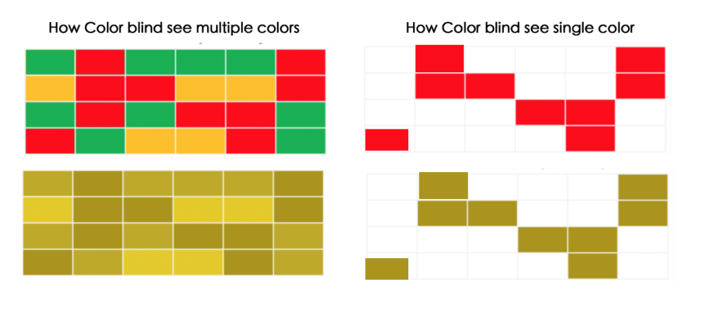
- D you like to use red, yellow, green(traffic light colors)? Think again! Did you know that 1 in 12 men (8%) and 1 in 200 women in the world are color blind? These colors will have minimum effect on them.
- Allow users to navigate easily
- Our brain understands objects as groups. Use the right chart at right place, Use size to organize the layout of your data and create a visual hierarchy. Simplify content to reduce visual elements to only the most critical.
- Use plenty of white space in your dashboard. White space helps to create mental maps. Also, White space has been proven to increase comprehension up to 20%. Don’t believe it? Take a look at this Worlds’s worst websites! 🙂


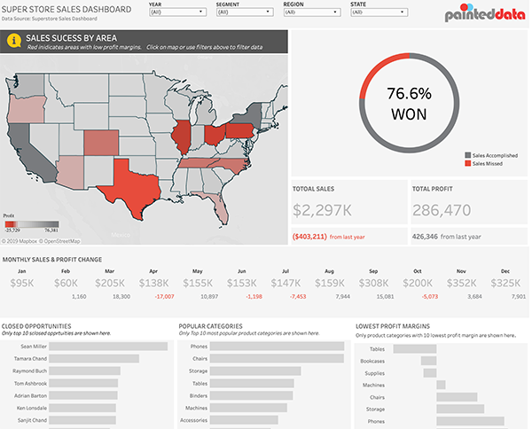
Below is the link to Tableau dashboard I created with Superstore data. Less is more! Happy Dashboarding!